The Daily is Rupert Murdoch’s endeavor to transform an old media into a new format on the iPad. It sounded it good in theory, but this facile attempt has proven that doing things the old way won’t be without new problems. In this case, big problems.
Want to know something crazy? I knew this was coming. I knew that Murdoch’s fabled attempt to put a newspaper on the iPad was going to be a complicated task, and I knew it wasn’t going to be without issues. But what I didn’t know is how right I would be. I was also shocked that it would become so clear so soon.
The problem is with one man: Rupert Murdoch. As I pointed out before, the man lives in a world where old media is king. He has the idea in his head that he can do things the old way — things he has done for many decades — and have them pay off in today’s technological landscape. He believes that you can put a price on the news, even if there is nothing unique about the product being provided. He also seems to believe that you can compete with news — meaning that he can possibly repackage the news and slap a price tag on it — instead of competing on topic, form, format, and other distinguishable factors.
It is that thinking that will cost him his empire in the end, but, for now, we still have to deal with it. The Daily, however, is just another reassurance that Murdoch doesn’t get it. It isn’t the fault of the publication’s staff, the iPad, Apple, or any other entity out there — it’s just him. It’s also too bad, because this had potential.
The Daily‘s Lackluster Design
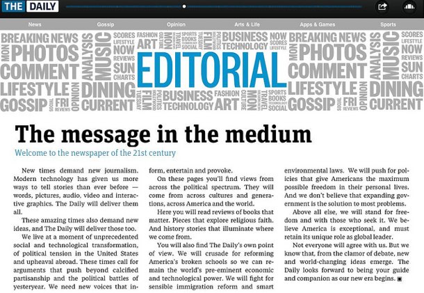
The first problem The Daily is a fairly serious one: there is an identity crisis. The publication looks, feels, and acts like a magazine, which isn’t necessarily a good thing. There are many pictures to go along with the articles, and it is obvious that designers took extra care to make it known that news can be beautiful. But they are trying too hard.
Poor user interface (UI) design is a killer. The everyday joe doesn’t know what I mean when I say that, but it essentially means that this newspaper’s interface is organized in a way that is inefficient for its users — it is far too difficult to navigate, it takes too long to get to where you want to be, and there is no easy way to get to the information that you want to. It is, in a sense, poor packaging.
Furthermore, it has been mentioned that the UI has been inconsistent from article to article within the application. Sometimes a user would, for example, want to zoom in on a photo to see the detail, but they can’t, even though on another article a photo could be zoomed in on. Also, sometimes turning the iPad into portrait or landscape view will provide different content, but other times nothing happens at all. And there are numerous other tidbits that lessen the overall experience. It’s these inconsistencies that take away from the overall package.
Another glaring omission is the inability to enlarge text for the sake of making it more readable. There is not even a zoom function. (Yet you always see the ability to increase text size on most other newspaper websites.) It’s inexcusable for an application that is supposed to be one of a kind and of the highest quality for the iPad platform.
All of this ultimately leads to The Daily seeming like most of the other magazine applications that swarm the iOS marketplace. Nothing spectacular here to behold — it’s just something to look at once or twice and then forget about entirely.
The Daily‘s Dysfunctionality
If you think that the design of The Daily is disappointing, you’ll be further disappointed with the functionality (or dysfunctionality, as I call it). The sad thing, however, is that this problem becomes apparent from the moment you start the application. It all goes downhill from there.
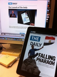
What’s worse than sitting in a line at the DMV for a few hours? How about staring at a lollipop on your Macbook for a few minutes (I would know). The moment you open The Daily is the same moment you will experience that very sensation. You will wait, and wait, and wait some more, all without any interaction or information being presented to you.
John Gruber discussed this point very eloquently, and I can’t help but agree. To think that in this day of information that users would be restricted to waiting at a screen with nothing to do and nothing to interact with is crazy.
Ironically, just as slow as it is for The Daily to even get started, it also fails to keep up with the pace of the daily news scene. Considering that Murdoch was going pushing for the newspaper format on the iPad, it seems like it would be a good idea to be breaking news instead of lagging behind the times after everyone has already read about a story from their friends on Twitter and Facebook.
Perhaps it is taking so long because The Daily is attempting too hard to be like a magazine — presenting information with great graphics and design aspects that look pretty to the eye but proving costly in the amount of time required to publish. There is a balancing act here. And, of course, I know that the five-page feature on the Running of The Bulls deserves vivid imagery, video, and other media, but keeping us updated about the Super Bowl doesn’t take but a few words to get the job done.
Be a newspaper or be a magazine — but if you want to be a newspaper, then you better get information to the masses as fast as possible, because you are competing on time, unless you bring quality on the level of The New Yorker (which is actually a magazine).
Be fast, be interesting, be informative, be unique, but never ever be boring!
The Price We Pay
Most ironic, however, is the price people pay for The Daily. It is a dollar per week, thanks in part from Apple’s inclusion of recurring billing. But it can be obtained for free. Okay, I lied — The Daily iOS application can’t be obtained for free, but the information that is presented within it can be, thanks to The Daily: Indexed.
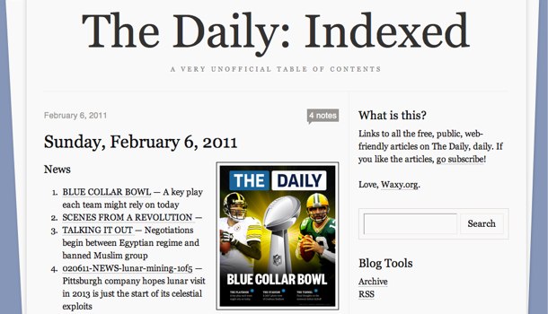
It was created because Andy Baio, the site’s creator, said that The Daily doesn’t provide an easy way to access information:
Why did I do this? The Daily’s publishing free, web-based versions to every article, but without an index, it’s (deliberately) hard to find or link to the individual articles from the web. And since the iPad app only carries today’s edition, it makes finding any historical articles you’ve paid for nearly impossible.
Take that person’s disappointment and come to the realization that most of the information in Murdoch’s newspaper can be found online for free, and this website becomes an inevitable creation.
When you consider that all an iPad user would have to do is navigate to this website using the iPad’s browser, scan the headlines, click the article, and read it — all without having to pay a fee, wait for the never-ending load screen, navigate with an unintuitive UI, and deal with difficult-to-read text — it is no wonder why this was created. It’s as much a symbol of the poor quality of the iPad application than anything else.
The Daily‘s Greg Clayman was quick to respond:
It’s not surprising that people want to share our content, but The Daily is designed for tablets, with a lot of rich media and a litany of interactive features and functionality. We are confident that as readers get to know our content, they will be driven to the full, authentic experience.
But it does seem silly to charge for the same information that can be had for free elsewhere, right? Aesthetics can get you far, but does the content really warrant such an effort? It’s a newspaper for crying out loud. I want to get in, get what I need, and get out. If I want an elaborate experience, I’ll read a magazine, which is exactly what The Daily should have been.
In the end, we made the mistake of expecting something better from both a news medium and a man living in the past; let’s be sure to never make the same mistake again.